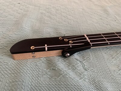
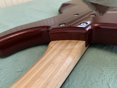
MPUbicki build thread

The "interesting" letters are the B and the C.
Good old Helvetica is close for most letters except the C.

A web search suggested Elisar DT Infant isn't a bad match, but its not quite and it didn't exist in the 80s'... Which got me thinking.. How would Phil have done this in the 80's..., It must be a common Letraset font!

And the answer is:

FUTURA

Ironically there's NO WAY you'd have guessed that M. Though the N in the digital Font is also quite distinctive, and a real bass the letters are too small to carry that level of detail, and the ends of all the letters loose their definition. Interestingly when photographed and zoomed you can see a shadow around the letters, which confirms that they were letraset, or similar transfer.


Kubicki Font.png
1732282395557.jpg
 
is there font experts here on Luthiers Corner? I’d like to cut MPU decal using similar font Kubicki has. Is Kubicki using some existing font or is it a custom for the logo? I can make P and U out of Kubicki letters but M needs more imagination. If someone wants to make a suggestion for MPU Kubicki-like logo please go ahead.
in case you were looking for the larger factor lettering in MPU style, this is what I see for an M shape with the references provided by the A. I took a crack at the U as well, but you could also extend the arms straight up echoing the C & R on their sides. This is obviously a hack MS Paint job. :)


IMG_0156.jpg
 
Thanks guys! That MPU looks like I imagined it could look.
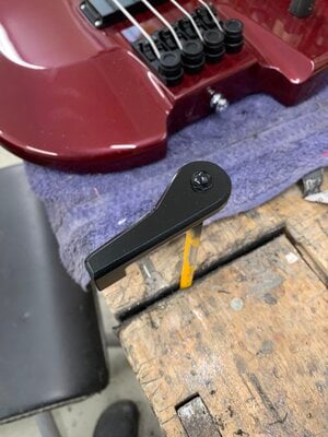
I started assembling the bass tonight. I got it to a playable state, tomorrow I’m trying to finish the lever and assemble it. I will wire the bass passive vol/vol/tone now and make the preamp after the bass is otherwise finished. Tonight I wired the pickups direct to jack. Sounds like a bass guitar thru Vox Amplug. Tomorrow I’m playing the bass thru audio interface to really hear how it sounds.
 
While I'm making terrible pictures with Paint, here's a screenshot of Paint and Word together. The lower pic is Calibri with 20pt character expansion on the Philip Kubicki and 3pt expansion on the California. Screenshotted to compare with the Kubicki logo. This is lo-fi nerd power.
Calibri is close. Microsoft have produced a number of knock-off fonts to avoid paying royalties on the "real" fonts (Ariel being the classic example) so I wonder if Calibre was intended to look like Futura. The C is a little off in Calibri but the most obvious changes the F - the lower bar is very high on Futura, while its much lower on Calibre. When you compare them the Caibri one looks "sad", being much lower.
 
  • Like
Reactions: Beej
is there font experts here on Luthiers Corner? I’d like to cut MPU decal using similar font Kubicki has. Is Kubicki using some existing font or is it a custom for the logo? I can make P and U out of Kubicki letters but M needs more imagination. If someone wants to make a suggestion for MPU Kubicki-like logo please go ahead.
Flip the A, removing the horizontal for the middle of the M. That gets the width of the letter right. Borrow "verticals" (angled) from F or T for the ends. Try the vertically flipped A in both horizontal orientations (as vertically flipped, and as vertically and horizontally flipped.)

I'm assuming you want the "FACTOR" font.
 
Last edited:
  • Like
Reactions: Reedt2000
Calibri is close. Microsoft have produced a number of knock-off fonts to avoid paying royalties on the "real" fonts (Ariel being the classic example) so I wonder if Calibre was intended to look like Futura.
Arial was created by Monotype under contract to IBM some years before Microsoft shipped its first graphical OS. Microsoft probably felt it was necessary to make sure documents printed from their computers could look like documents printed by IBM systems -- MS still had to struggle to be taken seriously as a Real Business Computer Company in the late 80s, so doing whatever IBM could do was important, and that would have to include licensing the same printer fonts.

Arial was designed to behave similar to Helvetica without looking like it, I assume partly because trends in fonts at the time were for letters that seemed larger and more open, and partly because those characteristics also coincidentally allowed them to look better on lower-res displays and printouts. And MS has spent significant cash since then to modernize Arial, enlarge the character set, tweak and improve. Now multiply that by the three other fonts in the original TrueType set, and again by the dozens of Western European-based fonts they've shipped since, and again by the dozens more for writing systems outside of Europe...

If nothing else, hiring or employing somebody to design a type family from scratch is way way waaaaaay more expensive than licensing one. Starting in the 90s Microsoft has had an entire department of designers and engineers working on fonts for computers -- designing them, improving the fonts they already have, and working on font rendering technologies (TrueType, ClearType, various methods of display antialiasing). MS doesn't get a lot of respect for its design decisions, frequently for justifiable reasons, but they are deadly serious about issues like accessibility and readability, and typography is a huge part of that.
 
  • Like
Reactions: Bruce Johnson
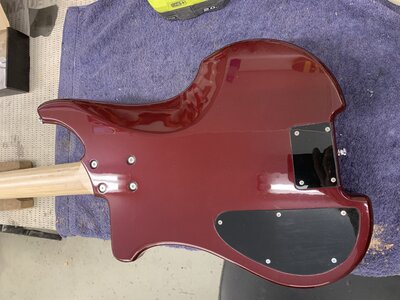
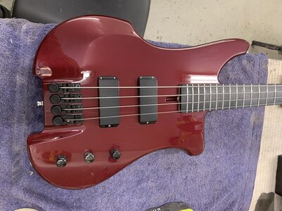
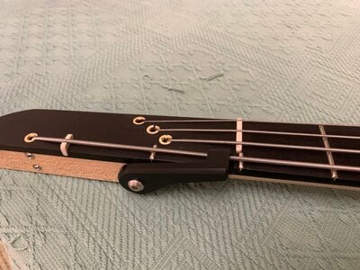
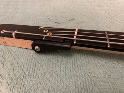
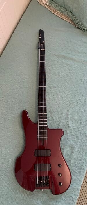
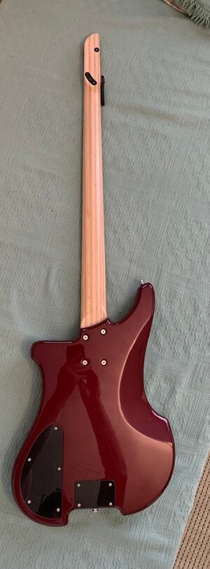
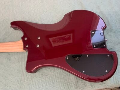
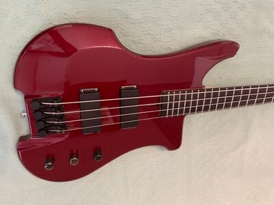
Here’s pics of the finished bass. I like the looks a lot, these Riviera tuners look great as a top turning Kubicki-esque tuners and are very well built, turn smooth and are easy to intonate and adjust string height. Cheap T-Bird pickups sound ok. They have enough highs, balanced lows and mids and sound quite clear. No need to make a different set of pickups. Laminated neck looks just like I wanred and feels and sounds solid. There’s more than enough sustain and clarity and playability is fine. All in all very succesfull buid. Knobs look a bit small, I’m buying new, bit bigger ones when ordering something else. Now I’m planning to draw a vero layout for the preamp and make it. Also making the logo when I have access to computer (mrs is doing her stuff with it at the moment).
 

Attachments

  • IMG_5294.jpeg
    IMG_5294.jpeg
    2.4 MB · Views: 2
  • IMG_5295.jpeg
    IMG_5295.jpeg
    2.1 MB · Views: 2
  • IMG_5296.jpeg
    IMG_5296.jpeg
    4.5 MB · Views: 2
  • IMG_5297.jpeg
    IMG_5297.jpeg
    3.7 MB · Views: 1
  • IMG_5298.jpeg
    IMG_5298.jpeg
    4.4 MB · Views: 3
  • IMG_5299.jpeg
    IMG_5299.jpeg
    3.2 MB · Views: 1
While I'm making terrible pictures with Paint, here's a screenshot of Paint and Word together. The lower pic is Calibri with 20pt character expansion on the Philip Kubicki and 3pt expansion on the California. Screenshotted to compare with the Kubicki logo. This is lo-fi nerd power.

View attachment 7083376
Personally I would straighten the upper sides of the U and fix the angles of the strokes on the M. And then tighten the letterspacing -- in FACTOR, see how the A undercuts both the F and C, and the TO pair almost abut?

For extra credit I might try connecting the M and top stroke of the P. Not sure if it'll work but it'd be worth a try, and be a nice callback to the CT ligature in FACTOR.

The MPU FINLAND doesn't quite match the text above it. Impossible to tell whether it's because the original uses a different drawing of the same face or the characters render differently. Although tbh it's so close and so small I wouldn't worry about it
Quick sketch... the angles of the terminals on the strokes are totally off, among other issues, but this should convey the ideas at least:
1732464823923.png

Personally I don't think the U works when it's that wide. Which makes sense -- in conventional letterforms the U is narrower than the O. And now that I've been staring at them I think I'd experiment with positioning the vertical stroke on the P and the angles of the M some more on the ligature MP.
 
Quick sketch... the angles of the terminals on the strokes are totally off, among other issues, but this should convey the ideas at least:
View attachment 7084683
Personally I don't think the U works when it's that wide. Which makes sense -- in conventional letterforms the U is narrower than the O. And now that I've been staring at them I think I'd experiment with positioning the vertical stroke on the P and the angles of the M some more on the ligature MP.
I think separate M and P work better that tied together. I agree that U looks a bit too wide.
 
  • Like
Reactions: ardgedee
I like the MP ligature, though I hadn't thought it would work without seeing it. Might give it a little extra on the left-top of the P for spacing and see if the feel of M being an M sticks without a vertical right there.

Width-wise for the U the entire FACTOR is stretched (these are not normal letter proportions for most fonts - the P is very wide, too), but this is you doing MPU so do what you like.

If you extend the lines past the "top and bottom of font" imaginary line when drawing them in whatever drawing program you are doing, you can then crop the image to the top and bottom of font to cut them off at the right angle.
 
OMFG! That is just incredible. Your typical impeccable attention to detail and craftsmanship, seemingly at lightning speed. With the font decal on it, perfection achieved. Will you have to add a clearcoat over the decal? This has re-kindled my Ex Factor lust of yore, always wanted one, still kicking myself for not buying one when they were more affordable. Sigh. So many basses, so little time.....
 
  • Like
Reactions: Reedt2000 and Beej